Total Pageviews
Thursday, May 30, 2013
This structure is the Opera House in Sydney, Australia. It looks quite stable because the base is visible to be very strong. The abstract exterior allows the visitors to feel curious as to, what it is- and this curiosity eventually invites the visitors- and when they go inside, they feel astonished- the shallow, yet tall, ceilings and the warm colors- dark orange, cherry red, and a hint of gold. The exterior shows curiosity while the interior shows beauty. The acoustic of the walls inside, also allow visitors sitting in the back- to hear the performance.
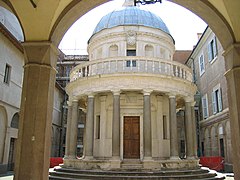
Tempietto di San Pietro in Montorio, Rome, 1502, by Bramante
This building depicts architecture from the Renaissance period. This is a structure in Rome that was created in 1502 by Bramante, an Italian architect during the Renaissance. As visible in this structure, we can see very common architectural elements like the column, dome,wall, floor and of course- arch. The columns are Corinthian as they have intricate detail of the head. they all surround the dome- painted in sky blue color, to give off a cool, yet inviting, color. The balcony, allows visitors to see around the complex. Since the balcony is lower than the top of the wall- they can not see outside the wall, it makes them feel enclosed and shrouded by four walls. The arch allows the visitors to come- not through the door, but the beauty and elegance of a tall- detailed arch. The floor, is mostly concrete, which does not make it too futuristic- it allows the visitors to feel the time period, to soak in the historical aspect and the warm sun. Lastly, the walls are decorated with small yet ample glass windows. These windows are not too big, since they are used to reflect Roman architecture- in which large windows were not used.
Reflect
Today we had a short project of creating a teen utopia. The high schools of today, are not functioning- they are falling apart fundamentally and students do not get the learning they need. So we had to create a structure, in groups, that would allow teenagers to realize the transition between childhood and adulthood. When all the groups presented, a common theme was visible- the teens should study AND play at the same time. The short project did not qualify for only sketches, no- but instead, we had to make a model to allow other groups to see our ideas and concepts. Today, according to Rafael, was one of the best presentation for short projects.
Wednesday, May 29, 2013
Reflection
Wed: 5/29 Today, we were assigned to do a short project: make a studio house for one person, with large and small alcoves. Instantly, I decided that the house would be innately rectangle shaped- around 300 square feet. But the alcoves would "pop out" of the right and left sides of the house. One alcove, the only small alcove, would be the bathroom. And the large ones would be a closet that served as a secret hallway to the main lobby. The lobby, which included the kitchen and the socializing area, and the studio would be divided by an opaque curtain. By doing this, a floor plan would look nothing like a square- due to the randomized placement of alcoves.
Tue: 5/28
Today we went on a full-day field trip to San Francisco. The weather was bipolar, occasionally changing from foggy to sunny and vice versa
Tue: 5/28
Today we went on a full-day field trip to San Francisco. The weather was bipolar, occasionally changing from foggy to sunny and vice versa
This building shows off a few architectural elements: the door, the repetitive ceiling, the chandelier, and the columns. The door was first used in Egypt- of course they were not fancy but they did serve a purpose at providing a gateway to a location and in some aspects it also provided privacy. The repetitive ceiling allows elegance to pour into the structure. When we look up, in our own homes- we usually see blank ceilings but now- we can see a repetitive and a beautiful, yet dull pattern. This form of architecture was first introduced in Renaissance Italy, and Rome. In this image, we also see various columns that seem to support the intricate interior. These columns focus on the detailed use of Corinthian order. Even though many buildings of today are modern/futuristic, the real beauty exists in the foundations- the Greek, Roman, and Italian architecture.
Thursday, May 23, 2013
Glass houses are interesting. They keep in the heat and block out the cold. They are, however, very expensive and they cost a lot to replace. In my opinion, glass houses are not worth the money and here's why:
glass is expensive, even to build
the house itself- when broken to pieces- can cost a lot to repair and it may not look like it did before
there is little to no privacy
However, here are some reasons you should buy a glass house:
fancy
more value on the market when you sell it, depending on the condition
keep heat inside and block cold outside
most importantly...........you can keep a gecko as a pet.
Ionic Order
Ionic order is one of various systems of architecture, in which the order is specific. In this structure above, the order is:
cornice-A horizontal molded projection crowning a building or structure
frieze-A broad horizontal band of sculpted or painted decoration
architrave-A main beam resting across the tops of columns
capital-The distinct, typically broader section at the head of a pillar or column
shaft-The body of a column; the cylindrical pillar between the capital and base
and finally, base- the bottom, or foundation, of a structure- upholding structural elements like columns or pillars
Doric, Ionic, and Corinthian are the three orders of classic Greek architecture.
Ionic order was first used in mid-16th century BC in Ionia, the SW group of islands inhabited by Ionian Greeks. Here are some examples of buildings with ionic order:
Erectheion
Library at Ephesus
Roman Colosseum
Temple of Apollo
Temple of Artemis
Temple of Athena Nike
Roman Forum.
A complete list is available:
http://www.greatbuildings.com/types/styles/ionic.html
Wednesday, May 22, 2013
This is an example of architecture from the future. As we can see, it is not a square- generic building. I believe this building is not, in terms of the future, beautiful because in scale- it over empowers the buildings below it. Additionally, it looks like a nose-bleed height. Imagine standing from the top looking down. What would you feel like. And what if there was an earthquake? There is no stable foundation and the concept looks useless. How would you like to go to the restroom when this building is sideways. Additionally, the jagged edges of this building may hit a plane at night. It may be an interesting concept, but it needs a lot more work if it can work in the future.
Doors
According to the Dutch architect, a door is "a place made for an occasion". It's designed,created, and utilized for privacy, security, and protection from most climates. Doors have not changed very remarkably-since they were first created and used in Egypt. The common form of doors- sliding doors and swing doors- were also used in Greece and Rome. The first automatic door was used in the royal library of China's emperor Yang of Sui Dynasty. Most doors were made of wood- but metals were mostly used for public buildings. In Renaissance Italy, door casings were an element of surprise and impression. These doors were decorated with columns and pediments in plain walls. New materials and resources like modified and stained glass soon came to light . Over time there were variations of doors-glass doors, and soon- revolving doors.
The new revolving door helped solve problems like heat exhaustion and negative air pressure in buildings. Later, around the 19th and 20th century different forms of doors evolved: panel doors, flush doors, French doors, pocket doors, etc. Additionally, gateways from sacred temples were also forms of very-old doors. They used cloth that would serve as a entryway and they also soon "upgraded" to elements like stone and such materials.This changed architecture because it revolutionized small elements of buildings. In my opinion, doors have evolved greatly over time. It is not a new invention, but it is a everyday, ever-changing invention.
Subscribe to:
Posts (Atom)