Total Pageviews
Friday, January 18, 2013
Presentations
Yesterday was the final day for working models. We presented our work- a model, a floor plan, and a section/elevation. Every group had two weeks to work on it and we all presented in table groups. We had only 15 minutes per group to present- and each member of the group had to talk at least once. The models were not perfect, they were working models. Our floor plan was just a sketch, still needing improvement. We felt as if we were under attack- we were being bombarded with a lot of questions- some relevant...others not so relevant. Regardless of their relevance, I think we can use these to improve and change around the project. We really need to change a lot since our school is larger than the space we chose. I think, we should really stick together for the last few weeks and not mess around too much. We didn't have anything until two days before the deadline.

 Today we visited Stanford University to explore the architecture of the buildings. The church, for example, had an amazing interior. It had a large-diameter dome that was crafted with translucent glass. Also, in the church, there were many thick pillars. I think these were used to hold up the remaining weight of the church. Outside of the church- in the main quad, there were many arches that were the main attraction. There is a specific name for a series of arches supported by columns- they were called arcades.
In the d.school- or design school- the ceilings were naked, there was a roof- but no ceiling. Apparently it was a source of inspiration for the students. The d-school was designed for students who were interested in design and prototypes. The materials of the classroom were very inexpensive, cheap , and easy to make. In my opinion, I believe all the buildings were structured in such an attractive way- I found the building very attractive and amazing.
Wednesday, January 16, 2013
In Chapter 2, Paul Goldberger expresses the architecture of the Chartres Cathedral, the University of Virginia, and the Unitarian Church in Rochester, New York. He re-introduces the character of Karsten Harries, and explains the "ethical function of architecture". Goldberger expresses the gap between aesthetics and practical function. He believes that we can just look at buildings the way they are- or we can understand their principle and admire their beauty using aesthetics. Chartres and University of Virginia are both buildings where aesthetic ideas are shared with a larger social idea. Goldberger emphasizes falling water- that it should be observed as a social idea- he believes that it symbolizes the relationship of family and nature...or the relationship of home and hearth.
Goldberger describes the architecture of the Unitarian church in great detail. We can visualize the square shaped room, the concrete ceiling, and the corners open to the light towers. He compares this building to the Yale Art Gallery-because it also has a brick building, with a concrete interior, a similar roughness. He also describes how the beauty can't be seen at first glance- but it can be seen when observed in great detail and multiple times. Paul Goldberger takes a stab on the idea that many works of architecture that we love and care for the most- are not real works of art at all. By saying this, Goldberger does not mean to say that our taste in architecture is bitter. Instead, he expresses that it is difficult to not adore the classic forms of architecture (quote)" It is difficult not to cherish the tile-roofed, white houses of the Mediterranean, the shingled cottages of New England, the brick commercial buildings of the main streets of Midwestern American cities". He emphasizes that humans have a mentality of reacting well to some forms and shapes, and not well to others. He believes that we create a foundation of appreciation based on the ordinary. Goldberger wants us to observe in great detail- when we say that we want to differentiate buildings and their beauty. Conclusively, Goldberger says that it is not any easier to say that architecture is a form of great art, than it is to say for music or a painting.
 The Civic Center in San Francisco is an example of classical Greek architecture. It follows two main concepts of architecture- the dome and columns. The dome was used by early Greeks as the center of their building. It can be designed in any way- but there is only one shape for a dome- a semi-sphere. Domes can be lighted interiorly, or in some unusual exterior lights. At night, the domes are usually visible- since they are lighted interiorly. However, in the past- there were only candles and fires. The Greek domes, over 200 years ago, were never visible. They had no lightning inside that would give it a glow. The Civic Center also has columns. The columns were used widely over 200 years ago, by the Greeks- as well as the Romans. The columns are used to distribute the weight of the building into the pillars.
Monday, January 14, 2013

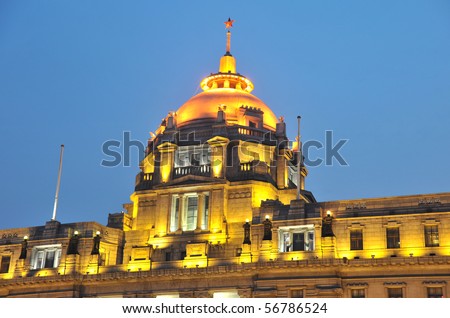
This is a building in Shanghai, China. It is located in a waterfront area called "The Bund". This is an example of classic architecture because it composes of many classic architectural elements. For example, the dome at the top is lighted in gold interiorly (inside). The structure of the dome was used frequently by the Romans. This dome looks as if it is made of translucent glass. Another element we can see are the columns. The columns were frequently used by Greeks and Romans. The columns were used to distribute the weight of the structure. If not used properly and precisely, your structure could topple over. Your columns should be strong enough to stand the natural elements- especially water and wind. Another element we can see are the small windows. The Greeks used the idea of small windows to keep the thermal heat indoors- especially during the winter.
Thursday, January 10, 2013

This is an example of Gothic Architecture. Gothic Architecture is usually seen in France- of the cathedrals, abbeys and churches of Europe. This cathedral has many arches at the gate. At the top, we see pointed towers that can be interpreted as columns. Gothic Architecture has been used in many countries- especially during the medieval period(s).
http://steventmcfall.com/classes/imd110/projects/artmovement/images/pcd04-77.gif

This is an example of classic architectural patterns in our modern life. The White House, as seen above, has at least one aspect of classic architecture- the four columns at the entrance. The columns were first used by the Greek and the Romans. The columns served as a weight-distributor. The column would hold up the surplus weight of the building. Also, the small windows were/are used in Greece. The Greece used these so the heat would stay inside the building, especially when it was cold outside. Another aspect is color. The Greeks used white to reflect the heat of the sun, and we can see this pattern in the color of the White House.
This is a concept used by the Greeks- the columns. Columns were used to evenly distribute the weight of the structure. As seen in this image, we can see that columns did not have a uniform design. Some were original- smooth and long; while others had the carving of elegant designs- seen especially in the Ionic and Corinthian designs. Although the designs were usually different, they all served the same purpose. There was no limit as to how many columns a building could have- although it would degrade the beauty, elegance, and attraction of the building.
This is an example of classic architecture. It is an arch from the classic architecture that was first developed by Romans. Arches are usually used for main entrances. This arch was painted in dull colors- a brown arch should not be on a wall that is painted yellow. We see this is an example of classic architecture because it is an architectural concept of Romans.

Wednesday, January 9, 2013

This is an example of Gothic Architecture. It has three main arches at the entrance, and two above the main entrance. At the very center, outside,there is a glass circle that could be used as a mural. The building has a bland, yet dark, color. It gives off an intriguing glow. There is a "vault" in the arches at the entrance. This building looks very enormous in volume. At the very top, there are two tall structures, that may represent towers. These "towers" look as if they are depending on the lower structure for stability.

This is a structure in British-Columbia, Canada. As we see in the picture, this building has 3 arches at the entrance of the structure. Below the base of the arch, we can see they have their independent column. Next to the arch, we can see miniature figures of priests. As we look beyond the arches, we can see that they create a "vault", or extended arches. Above the (outer) arches, we can see patterns in the architecture. There are small openings, which may be windows. In general, the color of the structure is mostly the same. The building looks enormous, even from the outside.
(If you can't see the picture above, type this into google images-------- 3353386528_e5178377a9.jpg
_large_medium.JPG)
This is a Greek structure, Parthenon. It was a temple located in Greece. As visible, it is "surrounded with columns". We focused a little bit on the architecture of wall-and-column. It was a little confusing for me, because I don't see how the columns can hold up in inclement weather, or in heavy weights.
The Parthenon is an example of classic architecture because it was one of the earliest structures in Greek architecture.
Subscribe to:
Comments (Atom)